

Creativity is the essential 21st century skill.
The World Economic Forum named it one of the top three skills required for success in the future of work.
Any organization that wants to be competitive needs to invest in cultivating human creative capabilities.
Over the past decade we have helped develop more adaptable, resilient and brave individuals, organizations, and communities through creative practice at work.
SERVICES

General Electric
Hundreds of executive leaders across the organization improved their ability to lead innovation through an experiential-learning course.

Richmond Regional Planning Commission
A diverse workplace uncovered ways to create better together and developed new approaches for engaging their community.

VCU School of Business
Students, faculty, and administration used their creativity as a competitive advantage in business education.
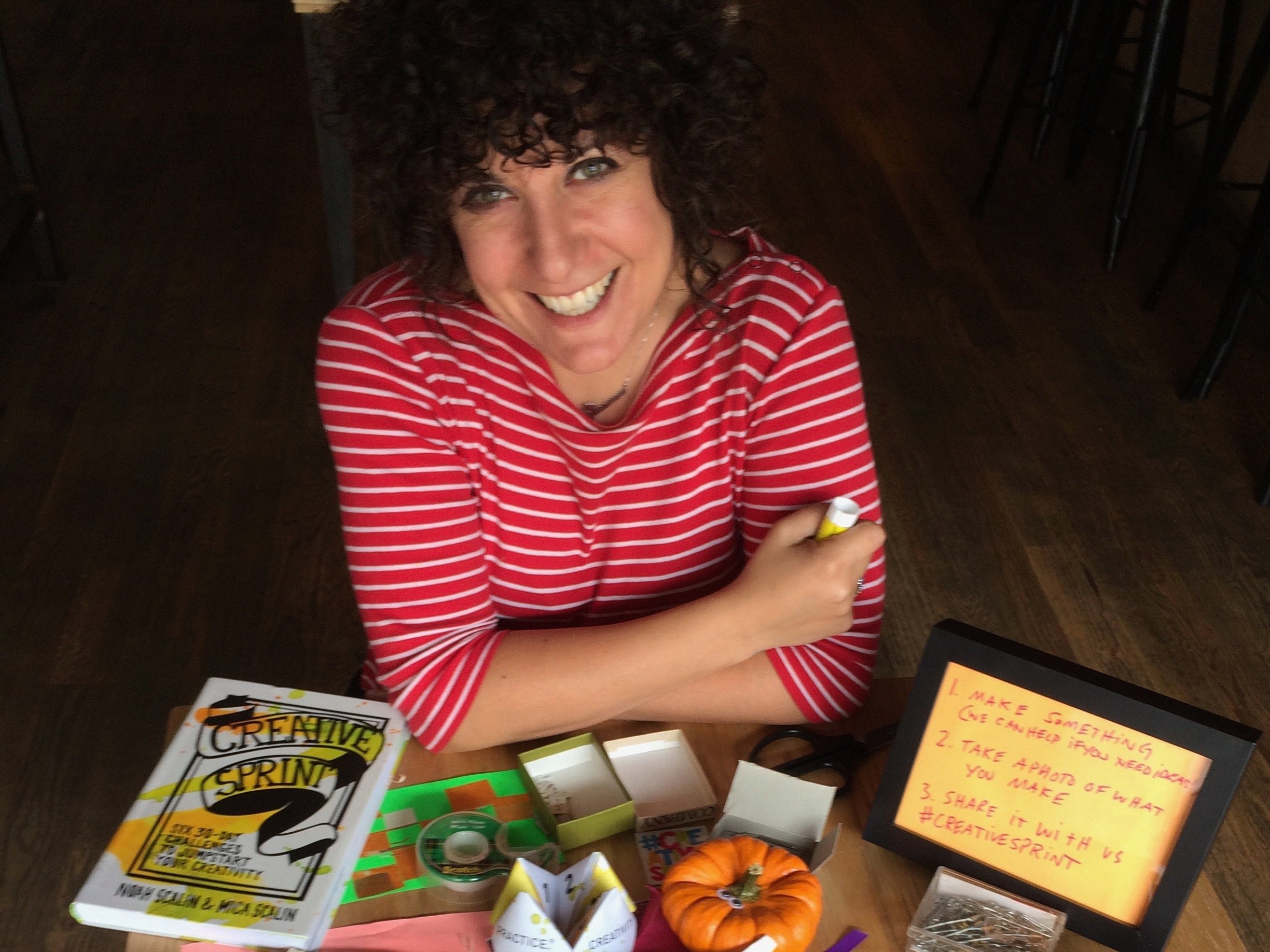
Our Tools In Your Hands!
The Creative Sprint® card deck includes everything you need to jumpstart creativity on your own. Now you can use our tools to tackle your most pressing challenges with more creativity right away.

